The Cobbler has Shoes! (the story of the Harmonic Northwest rebrand)
January 20, 2026
Have you heard the proverb about the cobbler whose children had no shoes?
Here at Harmonic Northwest, we felt a bit like that cobbler. We make amazing websites for our company clients and agency partners, but all the while our own website was rather lacking.
Well we finally decided to treat ourselves, and now this cobbler has some smokin’ kicks!

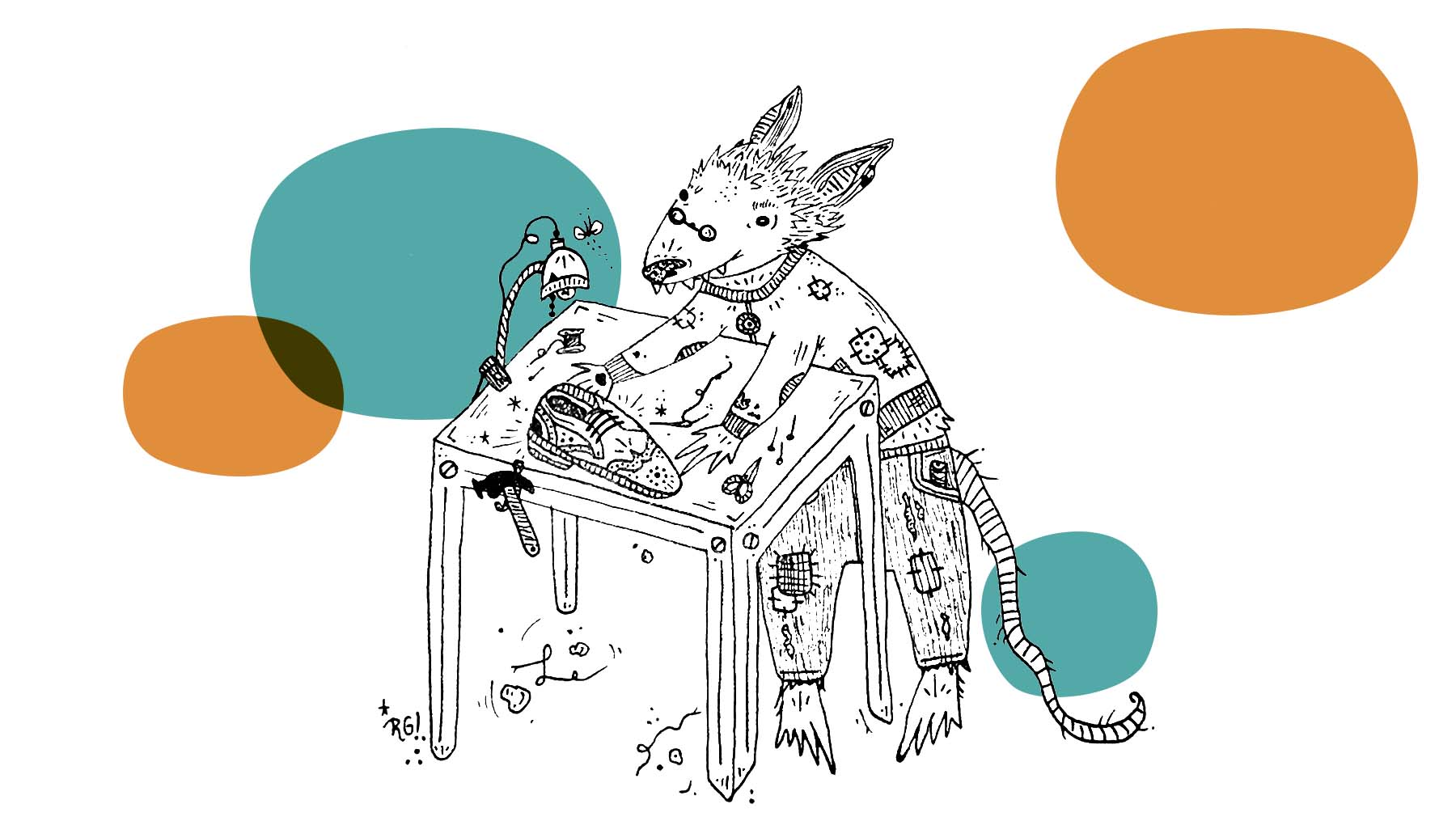
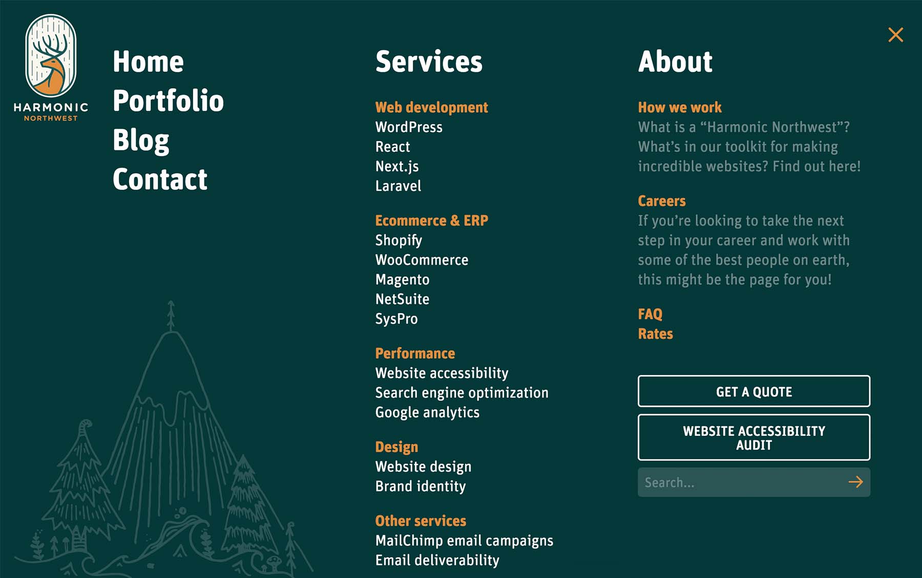
The new look leans much more heavily into the “Northwest” part of our name. Jameson Spence of Blocktype created the brand visuals that included the new logo and website. Local artist Ruby Gale contributed the delightful hand-drawn artwork of northwest critters and nature. Code for the site was started by David Siemers, picked up by Kelsey Kopecky, and taken down the home stretch by me (Gage).
If you’re interested in learning about why we rebranded and some of the thought process behind it, just keep on a-scrollin’…

The beforetimes
Before I go on about how the new branding came to be, I think it’s worth talking about the origins of the old look.
When I bought the domain name for harmonicnw.com back in 2004, I wasn’t really sure what the site would be. I was an indie rocker, designer, animator, videographer and web developer (roughly in that order) and I wanted a name that could serve as a homebase for any and all of those things.
I put together a first website outlining the offerings of my “company” which included recording jingles and producing audio. The website was built using HTML tables and Dreamweaver (as one did in that era) and featured a simple design with a bright blue and vivid orange color scheme.
Later I enlisted a colleague from CMD Agency to do some proper branding for a v2 of the site. I suggested that he lean into my musical background and go for a somewhat flashy tech vibe. And with that, the long-running version of the orange Harmonic Northwest website and the hexagon and squiggle logo were born.

The rebrand
So why did we decide to do a rebrand?
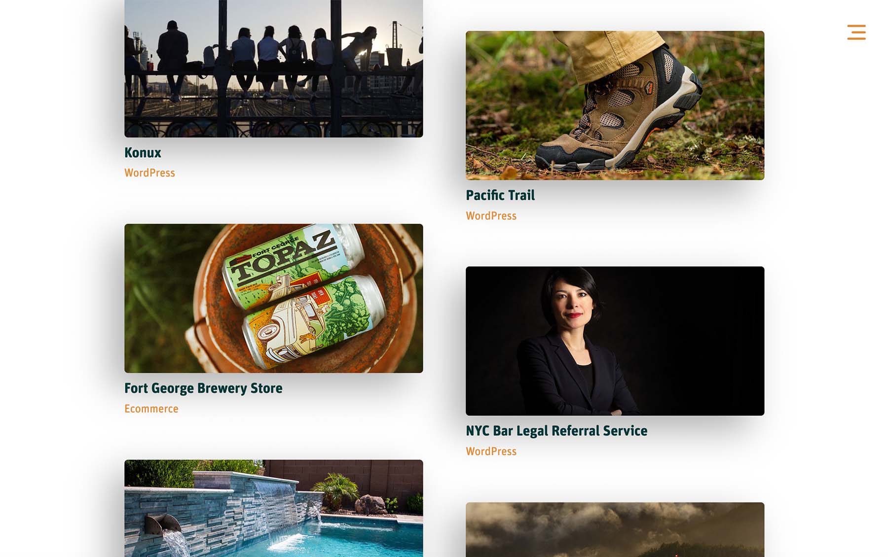
While it’s true that the old site wasn’t too bad and was still relatively serviceable, it just felt like it didn’t quite match the level of work we’ve been doing for our clients lately. Harmonic Northwest has built some amazing sites for big name companies, but you probably wouldn’t guess that from a quick tour of our old site.
Also, it just didn’t quite feel like us. The color scheme was as bit too in-your-face and artificial. The squiggly line for the logo was in step with some of the brand messaging that visualized a chaotic waveform becoming streamlined, but otherwise it didn’t make a lot of sense without that context. You might guess we were a medical device company or maybe something to do with analytics based on the logo.
A brand that embraces the northwest vibe
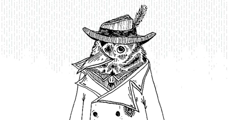
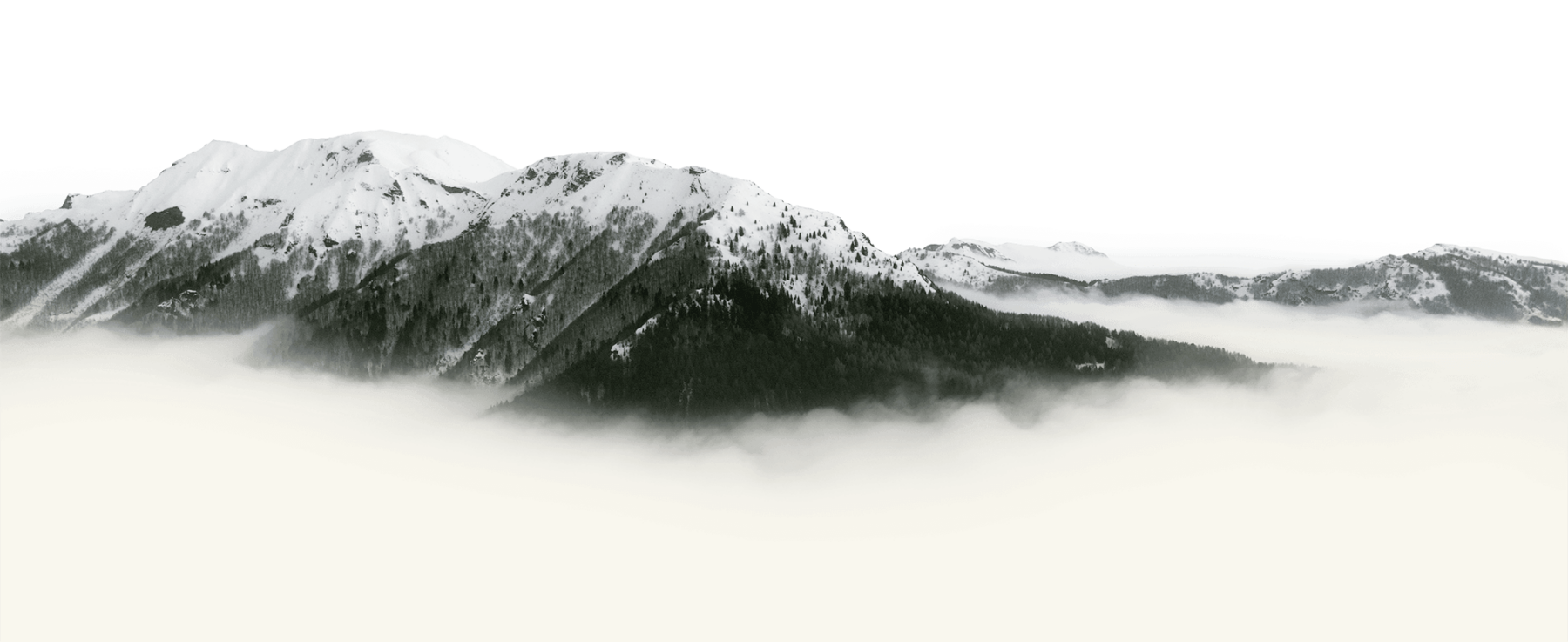
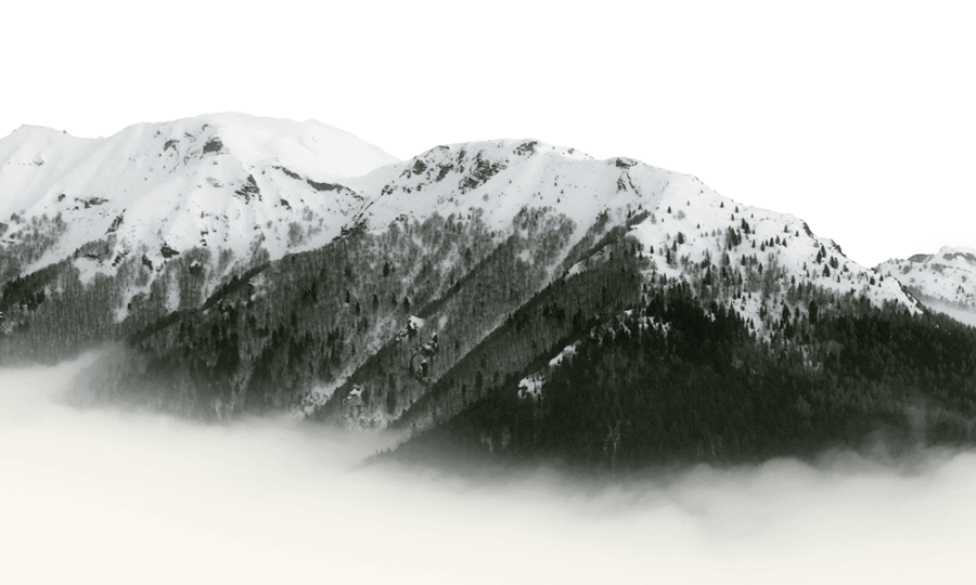
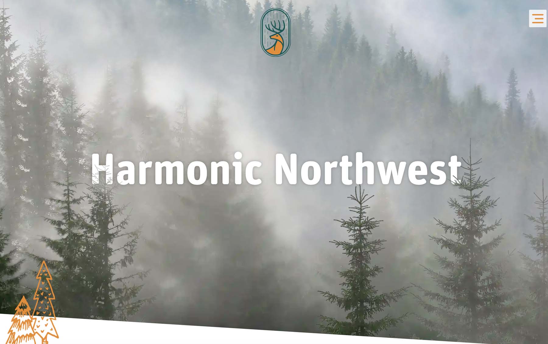
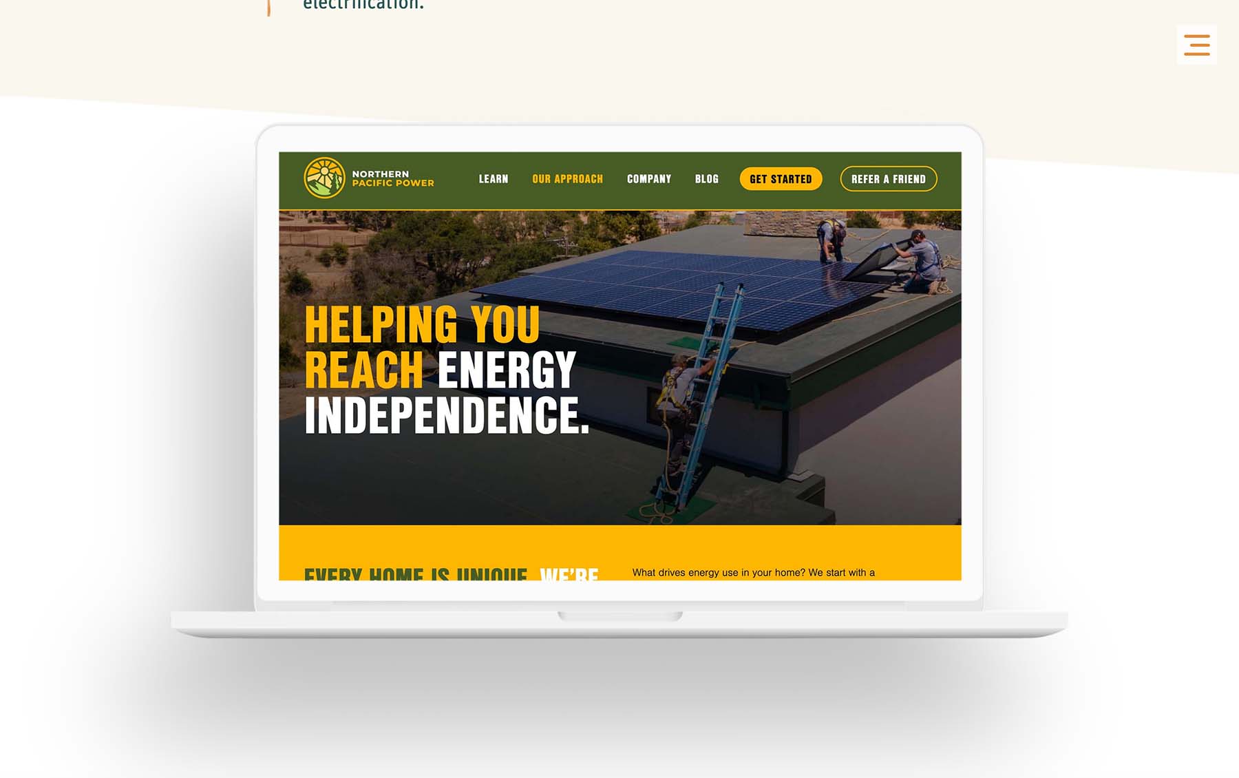
The new brand exudes northwest. We use photography featuring foggy mountainsides with soaring doug firs, majestic deer and bellowing elk. Hand-drawn images of moose, bears, skunks, foxes, moles, mountains, lakes and trees contribute even more northwest-ness. The color scheme features a deep green with a bit of calming blue and an earthy brown/orange that evoke colors from nature.
The logo mark itself features a single buck deer, which is an animal commonly found in (though not limited to) the northwest. Deer are sort of the spirit animal of the town I live in, Port Townsend, Washington, and bucks like the one in the logo regularly tramp through my backyard. Symbolically, buck deer often represent strength, protection, abundance and vivaciousness. The deer is depicted with rain falling in the background, which is important for keeping our forests mossy and green, and is also a symbol for growth and abundance. All in all it seemed like an appropriate emblem for us.
Smart and approachable
I wanted to integrate the whimsical hand-drawn art as that makes the site feel more approachable and gives some opportunities for small moments of delight. It was important to me that it feels like you’re viewing a website that represents a group of people who are kind, communicative and down-to-earth. I thought this warmth might be a distinguishing factor in an industry where people spend a lot of time pushing pixels and flipping 1s and 0s.
And in an age where all things creative are being disrupted and replaced by AI, there’s something to be said for having a website that has some very human-crafted looking elements.
We also wanted a site that felt open and airy and not boxed in and heavy, and I think we accomplished that. That weightless elegance contributes to the readability, usability and ultimately, loveability of the site.
By keeping the tone of the content casual and relatively succinct while showing off a bunch of great projects and outlining problems we have solved, I think the content strikes a good balance of showing off our smarts without seeming too full of ourselves and avoiding talking over our audience.
Visit the archive
The old site is archived at iheart.harmonicnw.com/harmonicnw-v2/ if you want to see the difference this rebrand made. Mad props to the enormously talented Michael Fofrich for putting together the previous design that stayed modern-looking for an eternity in web years.
More from the Blog